Editing your BaseKit theme will allow you to create a custom look and feel for your website while maintaining a consistent flow of style and appearance. By following the steps in this article, you will find that editing your BaseKit theme is easy to do and can produce great results.
Editing the Background
You can get started by customizing the background for your pages. The background can be customized by selecting the background button at the top of the page. You can then select several different background styles which will apply to the whole page.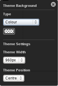
There are several background types you can select from:
- Colour mode: use a solid color background
- Image mode: use an image as the background and optionally repeat the image horizontally or vertically
- Linear gradient: create a blend between two colors
- Flex mode: use an image and scale the image flexibly so that top and bottom third are kept unchanged and the middle portion is scaled.
After selecting the type of background you would like, you can also select some options to format the background:
- Theme width: should normally be set to 960px. Warning: changing the width may impact the layout of your site.
- Theme position: will place your site on the left, center or right of the page. It should normally be left set to center.
Editing Rows
If you prefer, you can also customize the style for individual rows.
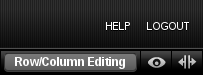
To do so, you will first want to clickRow/Column Editing in the upper right corner of the editor. This will enable row editing. You can then access the row styles panel (on the top right side of each row) to make modifications to the current row.
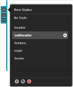
Click the gear icon (change row style) to edit a style.
Styles can be cloned for future use by using the buttons at the bottom of the panel.
 The Plus button allows you to clone and customize existing styles.
 The Copy button allows you to make a copy of a style.
 The Delete button deletes the current style.
There are also several options that will allow you to customize the style you apply to the rows. These options will appear in a drawer at the bottom of the screen when you select the gear icon in the Row styles pop out menu.Advanced Row & Column Editing
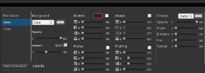
Each row style has an inner and outer style. The inner style is always in front of the outer style. The outer style extends to the edge of the browser window.
Background Color, Gradation or Image
In the second column of the row styles drawer you can select a background color, gradation or image. If the row contains multiple columns, the gutter slider can be used to change the widths between them.
Row Border Width, Radius & Color
In the third column of the row styles drawer, you can select row border width, radius and color. Click the check box to apply the same value to each group of sliders. Note: you must choose a color to make the border visible.
Margins & Padding
In the fourth column of the row styles drawer, you can set margins and padding for the row. Click the check box to apply the same value to each group of sliders.
Shadow Settings
The fifth column allows you to set shadow settings. Set the color for the shadow to black and then move the other sliders to see that
shadow.
If the template you have selected has columns as well as rows, you can customize the columns in the same way that you can customize the rows and the background. All of the controls for the column style drawer are exactly the same as the row style drawer, with the exception that columns do not have an inner and outer style.
